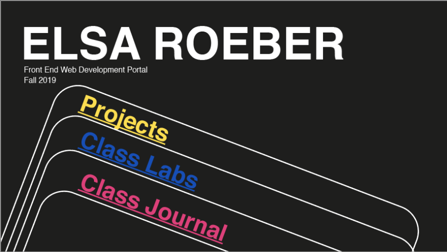
I made a class portal to organize links to all the work I made in Front End Web Development. The process of making my portal was broken down into a series of milestones. Click the image to visit portal, or read on for my process.
Milestone One Requirements:
- The concept/theme of your portal.
- Visual design for your portal.
- How it will respond in different environments/devices.
- The structure and flow of your portal
Below is a page from my sketchbook where I got a few ideas down initially:

Concept / Theme of Portal:
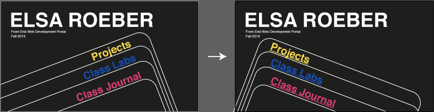
As a designer I really like simplicity and I pay a lot of attention to colors, so I wanted my page to have big shapes and bright colors. I also like vintage poster design a lot, and often look to those for inspiration. Some of my favorite posters are vintage Swiss ski posters (oddly specific I admit), so I ultimately settled on a Swiss design theme for my portal. I want it to be easy to navigate and enjoyable to look at without being distracting.
Visual Design:
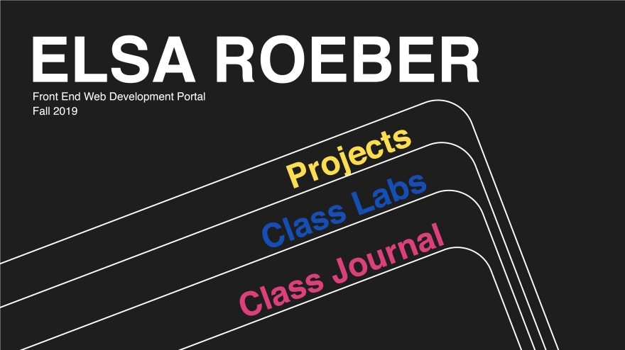
Below is my home page layout for my web portal. The big text in the center will be links to other pages containing my class projects, labs, and a link to this class journal.
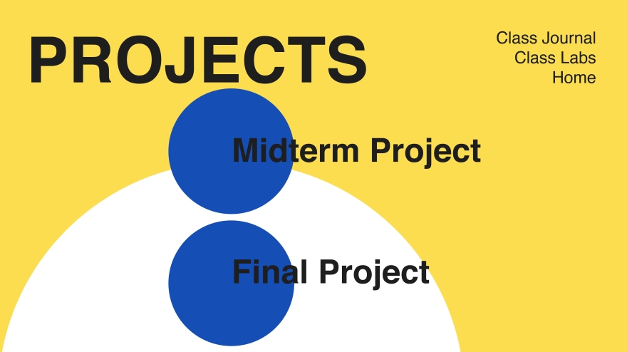
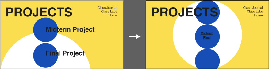
For my projects page I again want to have big simple links to my projects, perhaps with a hover event listener to show a thumbnail of the project in the blue circle when the mouse hovers over the link. I was not sure how many projects we will have over the course of the semester, so the page can scroll down to accommodate more links.
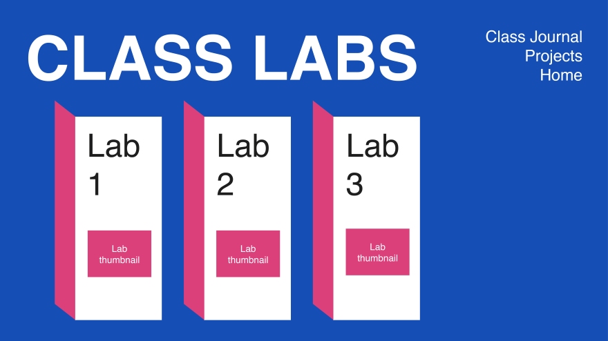
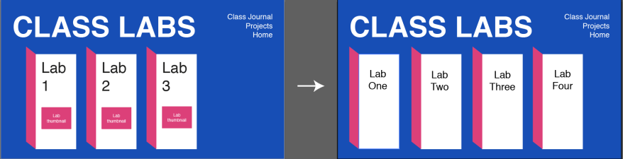
Here is the design for my class lab page. The navigation at the top is the same as my projects page.
My Portal in Different Environments:
To make my portal adaptive to all screen sizes, the big title at the top will shrink and fit on one line, and the navigation menu in the corner of the project / lab page will fit underneath the title. The links to each lab or project will stack on top of each other in a way to make it easy to scroll through on a phone or tablet.
Structure & Flow:
I really want to focus on simplicity of my navigation so the user doesn’t have to worry about navigating my portal whilst trying to look at my work. The navigation menu in the top left allows the user to go straight to the project, lab, or journal page without having to get back to the home page. Each linked page will have big sections to click on to see a project / lab, which will then open into a new tab.
Milestone Two Requirements:
- Documentation of the process you went through creating your portal
- Iterations of your visual design
- Describe problems you encountered and how you resolved them (or not)
- Sources you used in creating your portal
- Lessons learned of what worked and what you’d do differently next time
- A link to your portal
My Process [include iterations of my visual design]
I started with the home page, and basically tried to recreate the designs I made in Illustrator before writing the webpages. This was an interesting process of learning how to translate my design ideas into html <div> tags and CSS choices. Ultimately the only sacrifice I made was the direction of the tilt for the boxes on my home page. The reason for this was I was struggling with the combination of box tilt, text tilt, and element alignment. I’m happy with the compromise I made with myself though!
Next I moved onto the projects page. Since the html elements of each of my pages is pretty basic, CSS was again my biggest task. For this particular page I was experimenting with the background-image property to get my circles in place. Turns out the replicating my original idea was challenging to me (I tried setting the background images of <div> sections and the <body> background), because of the borders and sizes of the html elements. Ultimately I decided on a simple circle design I was happy with by setting multiple background images and colors for the <body> of the whole page.
Last I made the labs page. One interesting part of developing this page was choosing to make each “door” to the lab it’s own .png image, and then making the image itself the link. Originally I struggled to set background images of <div> sections (similar to the projects page) but then realized it made more sense to me to make the image active links. This also made it easier when it came to setting media queries!
Problems Encountered
My biggest obstacles were related to CSS. Since I had a clear idea of my design initially, I knew what I wanted to accomplish, it would just take me several tries to actualize that vision with CSS. In order to overcome this, I experimented with my strategies for grouping elements in more intentional <div> tags, and ways to space out my content using CSS.
Sources
Since it has been two years since I practiced web design, I needed quite a bit of refreshers on CSS tricks and syntax. My main source was W3Schools CSS examples.
Lessons Learned & Reflections
Also, making this portal reminded me that I am excited to expand my web development tools, so future websites have smoother and more delightful user interaction using more elevated CSS and JavaScript or jQuery. Since I spent quite a lot of time brushing up on CSS, I learned to keep the end goal of usability in mind while building my websites. I really enjoyed making the media queries (surprising because I remembered those causing quite the headache in my first experiences in web design), because it forced me to think intentionally about my website on different devices. I know this is always important to think about, but until I was actively doing it did I think about UI across modes of interaction. I hope in the future I continue to be excited about this as my skills expand, especially since most web browsing is done on mobile devices these days!
One last chance:
Here is another link to my portal!
 Anyone Elsa?